Columbus, Ohio #3: The Faces of Columbus

IMG_0317

34″ x 34″
2018
$300

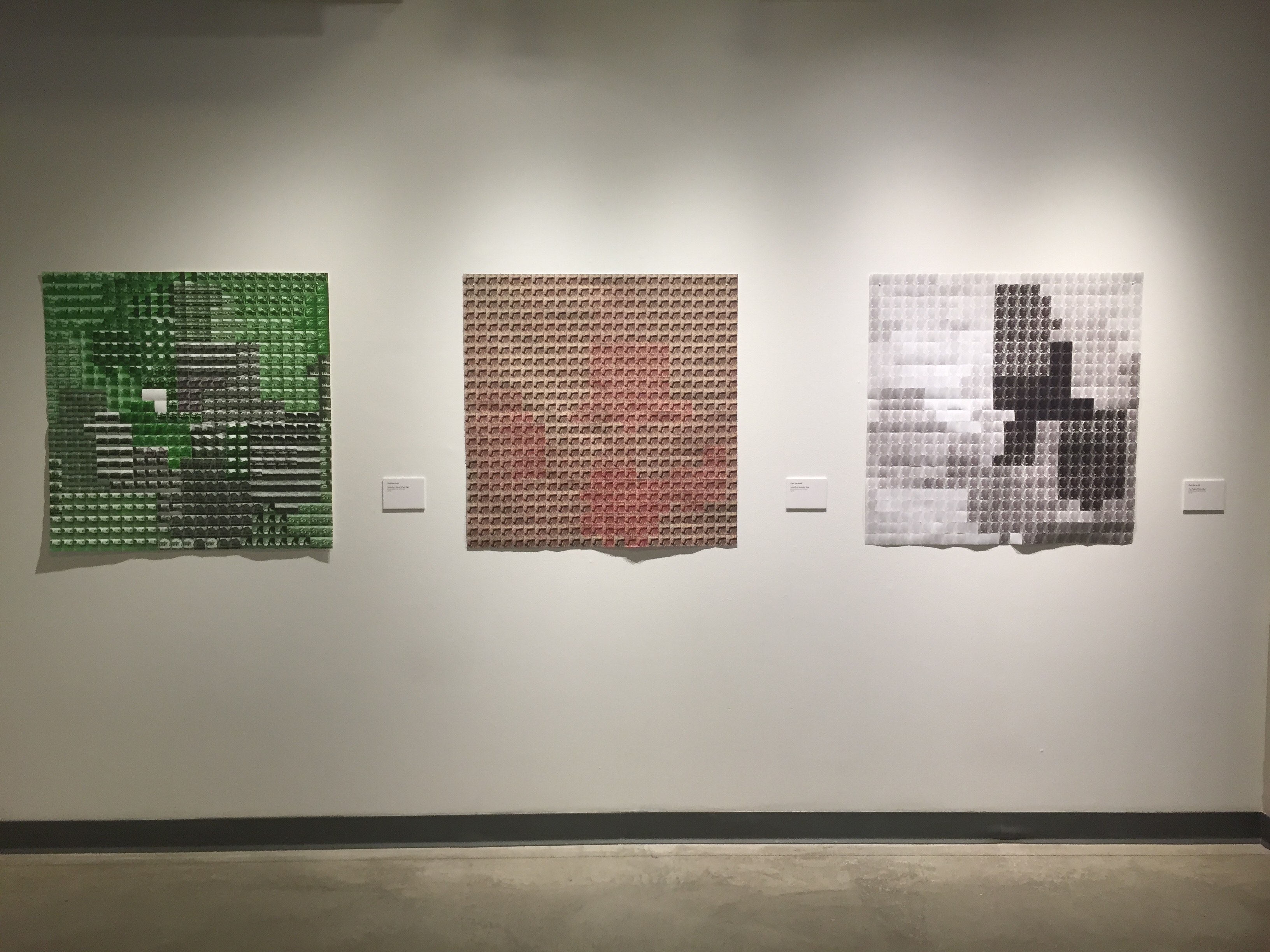
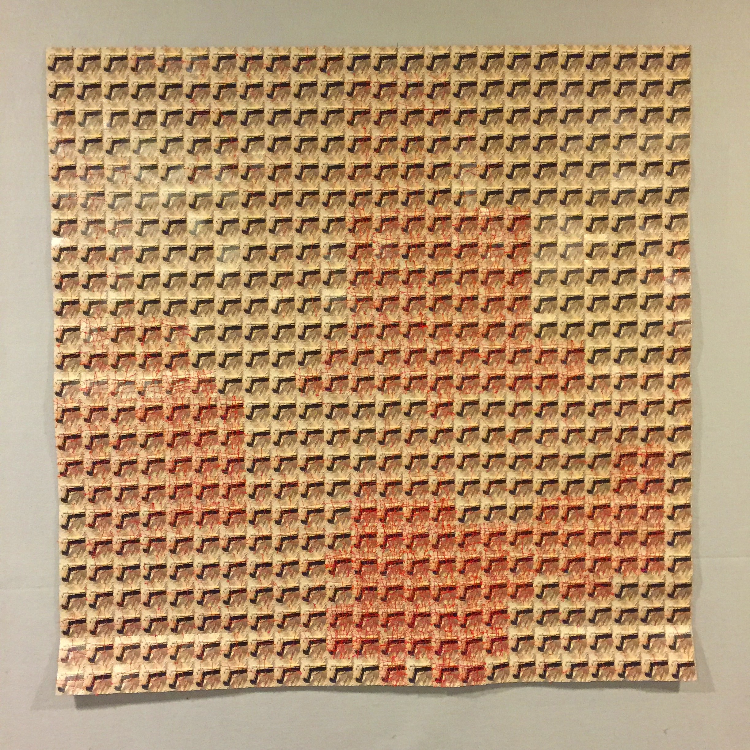
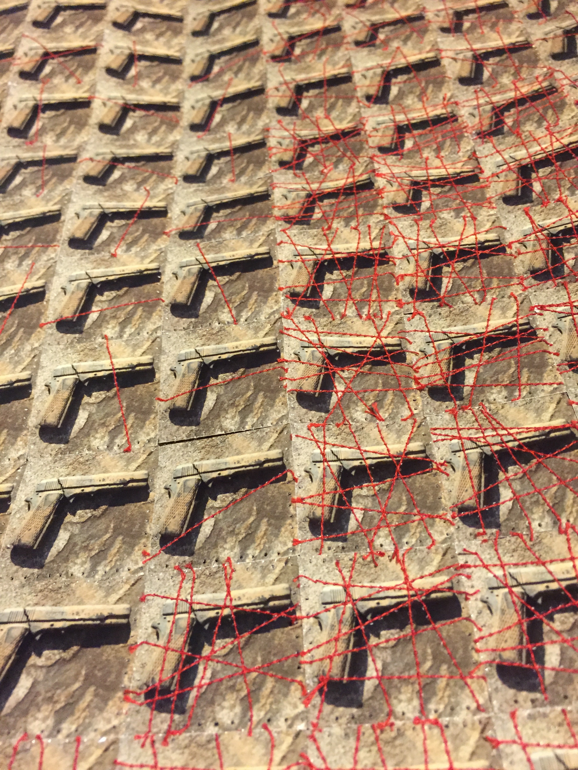
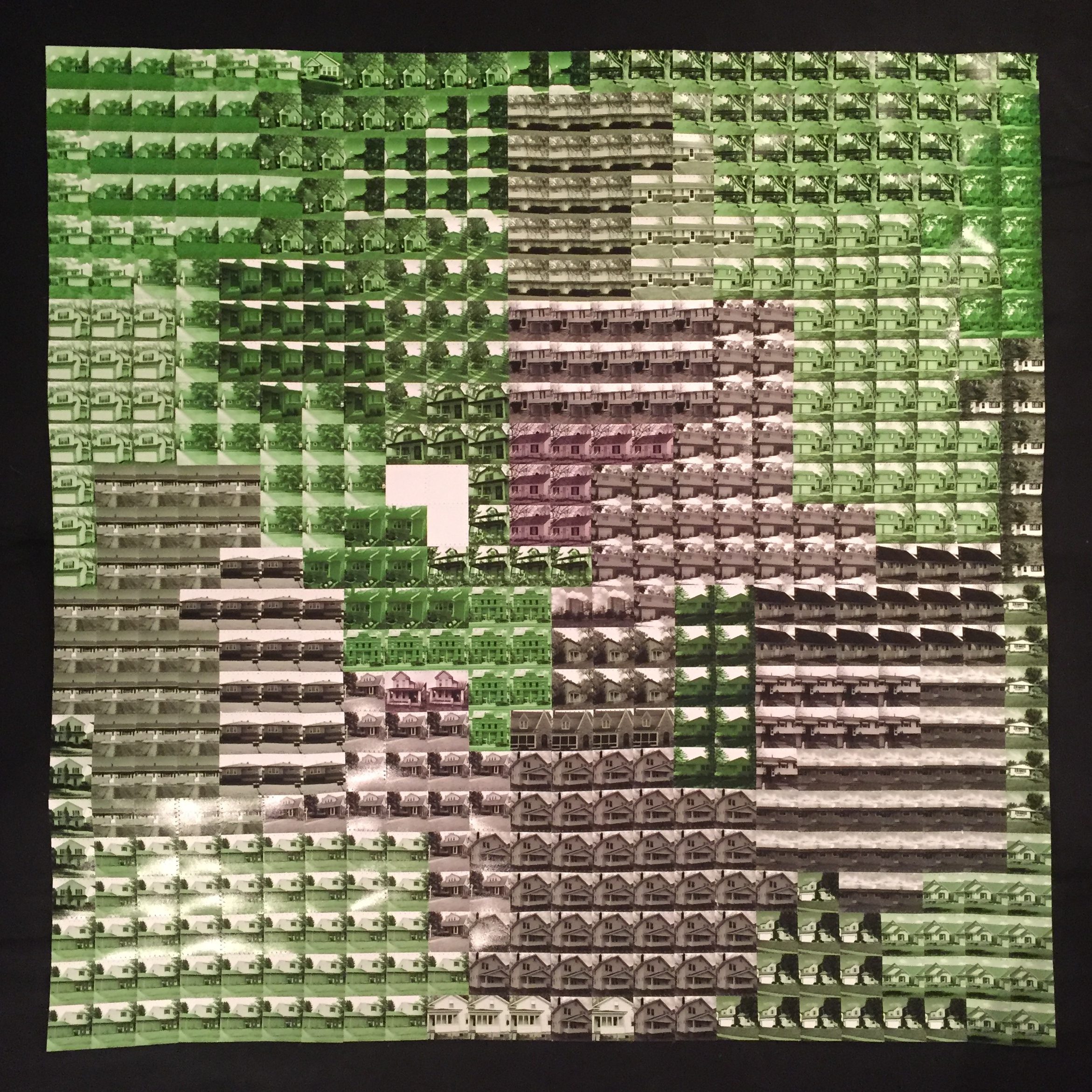
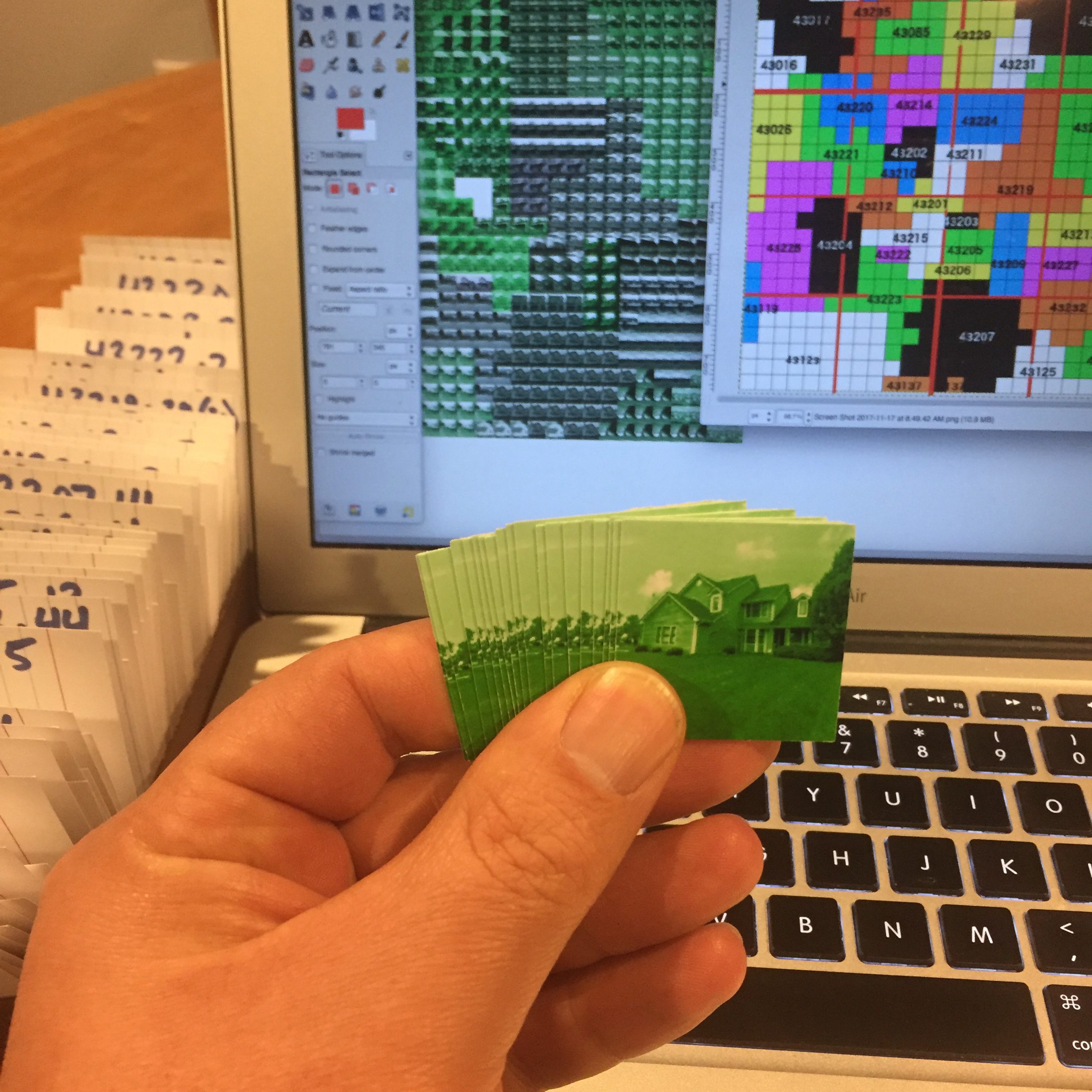
This photoquilt is the third in a series of maps of Columbus, Ohio.  The first included the median home values for every zip code in Columbus and the second tallied the number of homicides in each zip code.  This photoquilt incorporates census data from 2016 for each zip code in and around Columbus.

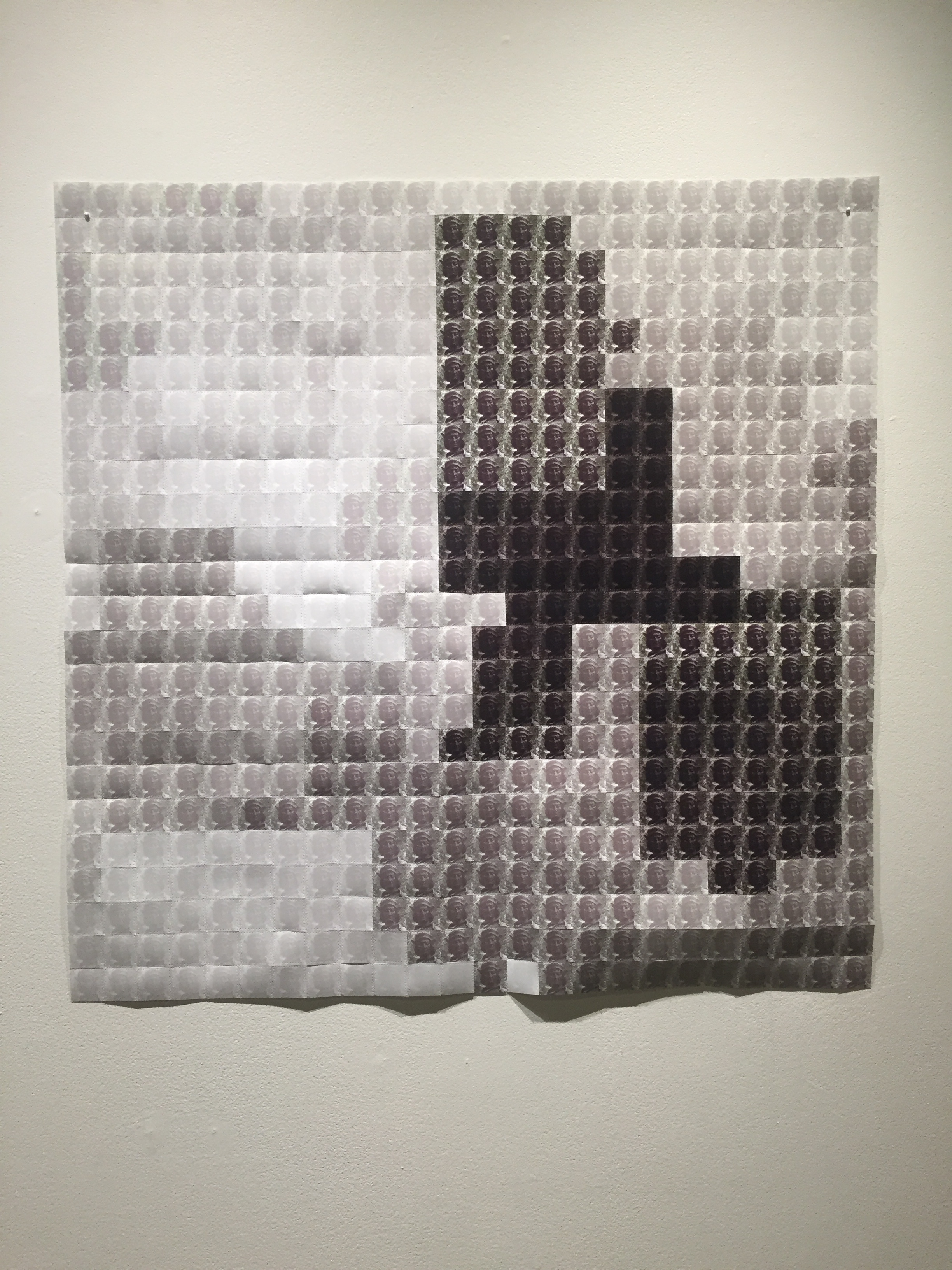
In this photoquilt, I took a picture of the statue of Christopher Columbus which stands on the Statehouse grounds downtown.  The image varies based on the demograhics of the population in each zip code — the whiter the population of a zip code was, the whiter I made the squares that make up that zip code.  The blacker the population, the blacker the photo.  Of course, there are also people who do not identify as only black or white.  In those cases, the photos representing the zip codes are also less black and white or more colorful.

Viewed next to the maps in the series, this photoquilt reveals some similar patterns.  Clearly, there are some strong correlations between wealth and violence and race in Columbus.  My goal with all three maps is to present this data in an objective and visually interesting way.  While I know the former is impossible, I feel like I’ve succeeded on the latter.

IMG_0316

Columbus, Ohio #2: Homicide Map

IMG_8470

34″ x 34″
2018
$300

This photoquilt is the second in a series of maps of Columbus, Ohio.  The first included the median home values for every zip code in Columbus.  This one records the number of homicides in each zip code.

Sadly, Columbus set a new record for the number of homicides in 2017 with 143.  In this photoquilt, every square in a given zip code receives a line of red stitching for each homicide in that zip code which ranges from 0 to 17.

IMG_8471
detail

The differences between neighboring zip codes are striking and, perhaps not surprisingly, correlate strongly with the median home values within each zip code.

I chose an image of a gun because 83% of the homicides involved a gun.  The photo is a picture of an old toy gun that I dug up in my backyard and photographed against my patio.  I really struggled with an appropriate image to use, but went with this one because it has a camouflage feel.

Because one image is used for the entire map, the zip codes are not as easy to distinguish.  However, clear patterns emerge as some zip codes are much redder than others.

Columbus, Ohio #1: Median Home Value

34″ x 34″
2018
$300

This is the first in a series of maps of Columbus, Ohio that I am making by sewing photographs together.  Each map will incorporate some set of data related to the city.  This map features the median home value for each zip code from 2015 US census data.

Within each zip code, I have taken a picture of a house for sale at or near the median home value.  The photo of the home with the highest value ($310,000) is tinted green while the photo of the home with the lowest value ($55,000) is not.  I have then tinted each photo green proportionally to the values in between.

photo squares for columbus map 1Keeping 576 squares organized.

Through color, a map of the city is formed.  The northwest quadrant, much of which is not technically Columbus, includes suburbs (Upper Arlington, Dublin, Hilliard) with very high home values.  This green area stretches down past the Ohio State campus (blank, because there are not homes for sale within the 43210 zip code) into downtown and German Village.  Another suburb within the city, Bexley, is the green rectangle just southeast of center.  Although I have left roads off the map, several are still easy to find.  The most obvious to me is I-71, which runs north-south through the top of the map.  To the west, median home values are quite high, while to the east they are much lower.

This map, and the data it depicts, is the result of several societal trends and civic decisions over the history of the city.  This piece is also a reflection on my ability to create an objective record of that history.  This map is a neutral artifact in the sense that it is a set of data that has been put through a algorithmic process.  This is the result.  On the other hand, it is impossible to design an algorithm without some cultural and personal bias.  In this way, this photoquilt cannot be completely free of bias, much like the very map it depicts.

The process of converting the map to a grid was an interesting challenge.  The short video below summarizes my process.  Look for more data-driven photoquilt maps soon.