Mostly Fives

14″ x 15″
photographs and thread
2019
$125

The color palette is bright and fun and less reserved than my previous piece. The colors mostly contrast the blue sky background, but some blend in almost completely. These 5s (and Ss, Es, and 3s) are an interesting motif to play with and I really like the variety I got even within this small sample. They each began as a (loosely) rectangular strip of color which I took two square bites out of. The location of the bites determined what letter or number the rectangles became. I mostly went for fives, but didn’t fight any variations I created, intentionally or otherwise.

Rainbow #1

rainbow 1

10″ x 7.5″
2018
Sold

This mini improv photoquilt was created for the silent auction at the Ecole Kenwood art show and sale where it was snapped up in a last-minute frenzy of bidding.

The rainbow is made from some of my favorite pieces to work with: photos of the colorful hoods, roofs, and trunks of hot rods and the white strips of photo paper that are cut from between photos when they are printed.  For this photoquilt, I started with a rainbow of seven colors and then gradually added the strips until I was happy with the balance and the spacing.  My original plan was to line the colors all up in parallel, but every time I laid them on my sewing table they all slid a little to one side or another and I found that I liked that arrangement better than the rigidity of the parallel structure, so I incorporated it into the final piece.

Because this piece was so popular at the auction, I’m currently working on more, one of which will be sold to the second highest bidder and those proceeds will also be donated to the school.

Fade to Red

IMG_0447.jpg

15″ x 21″
2018
$250

This improvisational photoquilt combines a few pieces and parts that I’ve used before: the metallic red rectangles from Red Turn and the thin, mostly white strips that are leftover after photos are printed.  I previously used these strips in Persistence of Winter.

My focus with this photoquilt was balancing the red and the white.  The result is a bit like a photo that’s been zoomed in a thousand times so that each pixel, which had formed a perfect curve, begins to break down and dissolve.  The shapes have some order without seeming patterned, almost like residential plots in a sprawling suburban neighborhood.

IMG_0448
detail

Persistence of Winter

IMG_8031

31″ x 31″
2018
$200

This is one of my first forays into improvisational quilting.  Instead of choosing a pattern and then cutting and sewing several blocks in that pattern, I took several photo prints and began cutting and sewing to see what I could come up with.  This photoquilt combines a stack of photos of a lovely yellow forsythia bush with several white strips of photo paper that are the remnants of the photo printing process — the strips are cut from between the prints to render them into their final size.

I was working with these prints in the springtime, which is probably what got me thinking about snow.  As I began cutting the prints and filling the cuts with strips, I thought about the snow that remains a constant threat to return throughout the spring but also the snow that recedes to reveal beautiful flowers like the ones on this forsythia bush.  And so, across the quilt, the snow gets heavy at times, and melts away at others, revealing the flowers beneath and between.

IMG_8032.JPG
detail

Handmade Chinese Coins

72″ x 48″
2017
$960

There is a growing “gig economy” though which I can have an Uber driver pick me up, a TaskRabbit organize my closet, and a pay someone a Fiverr to create a customized happy birthday message for my closest friend.  But I can’t help but wonder whether the people doing this work feel like they are being treated fairly by their customers and whether this work pays their bills.  This photoquilt is a result of my wrestling with this question.

For this piece, I hired workers on Amazon’s Mechanical Turk, an online marketplace where workers can be hired to perform Human Intelligence Tasks or “HITs.”  Amazon suggests that workers, or “Turkers,” be paid at a rate of $6 per hour, though many tasks fail to approach this rate.  I hired 95 people and paid them a living wage ($20 per hour in Columbus, Ohio) to take one picture each. The Turkers were asked to take a picture of the front or back of their right or left hand against a plain background with a minimum 600 by 900 pixel resolution and then provide these photos for me to use under a Creative Commons license (CC BY 4.0) meaning that the photos belong to the photographer, but I am able to use them commercially.  My goal was to treat my workers fairly and from the feedback I received, I met this goal.

The quilt pattern is a variation of a traditional pattern called Chinese Coins. The strips were created by feeding the copies of the hand photos through a paper shredder and sewing them into stacks of “coins” which effectively blends the block of coins into an anonymous average of all of the hands at once. The photos were sewn together by hand using a sewing machine, which, in itself, is a statement on the meaning of terms like “work” and “handmade.”

Thanks to all of the workers who provided photographs for this work (most of whom chose to remain anonymous): A.F., Adan, byesaw, frogman31680, J Dawson, Jamillah, Jessica, JMG, Joshua Johaneman, kenneth, M. M. Brown, Matt, me, Melty, MemeHandsRubberBands, nirmala, Palani, Ron Tropics, shiv, XIX.

This photoquilt was accepted to the Fine Arts Exhibition at the 2017 Ohio State Fair where it was displayed next to Ohio Star: Columbus Museum of Art.


Ohio State Fair 2017Two of my photoquilts on display at the 2017 Ohio State Fair Fine Arts Exhibit.

Motor Mandalas

motor mandalas 01-12

12″ x 12″
2017
$150

I have wanted to make mandalas for a long time.  I’ve watched the Dali Lama’s monks make a mandala out of colored sand — an exacting, days-long process that was only complete when the sand was swept up and tossed into a local river.  I’ve also had a copy of Paula Nadelstern’s Kaleidoscope Quilts – The Workbook for years, and, even though she walks the reader through several of her kaleidoscopes step-by-step, I have never fully wrapped my head around her process.  I’ve even made a photoquilt of snowflakes formed from images of tree tops.  But only recently did I finally resolve to  take the first step on my journey towards making a mandala; I sat down with some photos and started cutting them into different shapes.

As I began cutting and sewing, I noticed that it was the mechanical images that seemed to work best in the mandalas.  There was something about the details of the wires and tubes, bolts and chrome, metal and paint that creating compelling shapes from a distance but also held interesting details close up.

Motor Mandala 11
Motor Mandala 11

I worked with automotive images previously in my Wheels photoquilt, but this was from a different perspective.  Whether you know your engines (“Hey, is that a flathead?”) or you find everything under the hood to be a bit mysterious (“What do you call that doohickey?”) there is something for your eye to explore and reflect on.  Once I realized motors were my ticket, I made some prints from pictures I took at various car show this summer and got to work.

motor montage
Some of the source images for the Motor Mandalas

For about a week straight, I made a mandala a day, which was it’s own sort of meditative process.  Some of the mandalas contain two or three different engines mashed together, others contrast a swath of paint from a fender or two with the concrete that the cars were parked on when I photographed them.  Sometimes you can pick out valve covers and spark plug wires, other times there are just lines and shapes formed from assorted metalwork.  In all of them, I noticed that when angular, robotic faces started to emerge from the shapes I knew the mandala was revealing itself to me.

Motor Mandala 10
Motor Mandala 10

I wouldn’t say I found inner peace in this work, at least not yet.  But I have learned a lot about how to make mandalas.  For me, creating art is about the process; I develop rules for what works and what does not, I iterate, I ameliorate.  To make a mandala, I had to just start somewhere and just start making something.  I had to take that first step.

Self Portrait: Facebook

photoquilt - self portrait - facebook

72″ x 48″
2016
$1200

I have a love / hate relationship with Facebook.  I use it almost every day to keep in touch with distant friends and family, to keep up with the news of the day, and to share the various highlights and high points of my day.  I love that I can do this.

But the fact that I only share the highlights (and that you only share your highlights) makes Facebook an interesting lens through which to view each other.  Further, the experience is curated by an algorithm that makes sure I see more of the things that I like to see from the people I like to see them from, which can distort my view of the world.  I hate this distortion.

So who I am, on Facebook at least, is largely formed by my network — the people I have “friended” and what that tells Facebook about me.  This self portrait grew out of the idea of how my network of friends defines my “self”.

detail of single block - self portrait photoquilt

I took the profile photos of the first 144 friends who gave me permission to do so and fed them into a free downloadable program called AndreaMosaic.  The software created a composite photomosaic based on my profile picture, which I also provided.  The resolution was not great, so I added an additional 144 photos that these same friends had previously used as profile pictures.  This provided much better resolution.  I configured the software to use everyone’s profile photo at least once and to not repeat any single image too frequently.  After several iterations, I finally had a composite that I was happy with.

I printed out the photomosaic and counted up how many of each image I needed.  The quilt is 34 squares across and 51 tall, for a total of 1734 squares.  Many of the images were included just once or twice, but others appeared scores of times.  I assembled the images into 4 x 6 prints and ordered the prints that I needed.  I then divided the composite image into 6 x 6 blocks, cut out the images for each block, and sewed them together.  A video of this process is below.

Once I had all of the blocks completed, I laid them all out to make sure I had them all oriented correctly.  Then I sewed the blocks together into the final photoquilt self portrait.

The finished photoquilt is clearly inspired by Chuck Close’s portraits, of which I’ve always been a fan.  And like Close’s work, the experience of this portrait is very different when you are 18 inches away and when you are 18 feet away.  The further away from the work you get, the more your eye merges the collection of images into pixels that form the larger whole.  But up close, each individual is clearly visible.

chris with self portrait

Florida Historical Quarterly

mobile to settler, 1959 to 1978from top to bottom: mobile, herald, ocala, write, land, territorial, ship, john, cotton, fernandina, expedition, settler and from left to right: 1959 to 1978

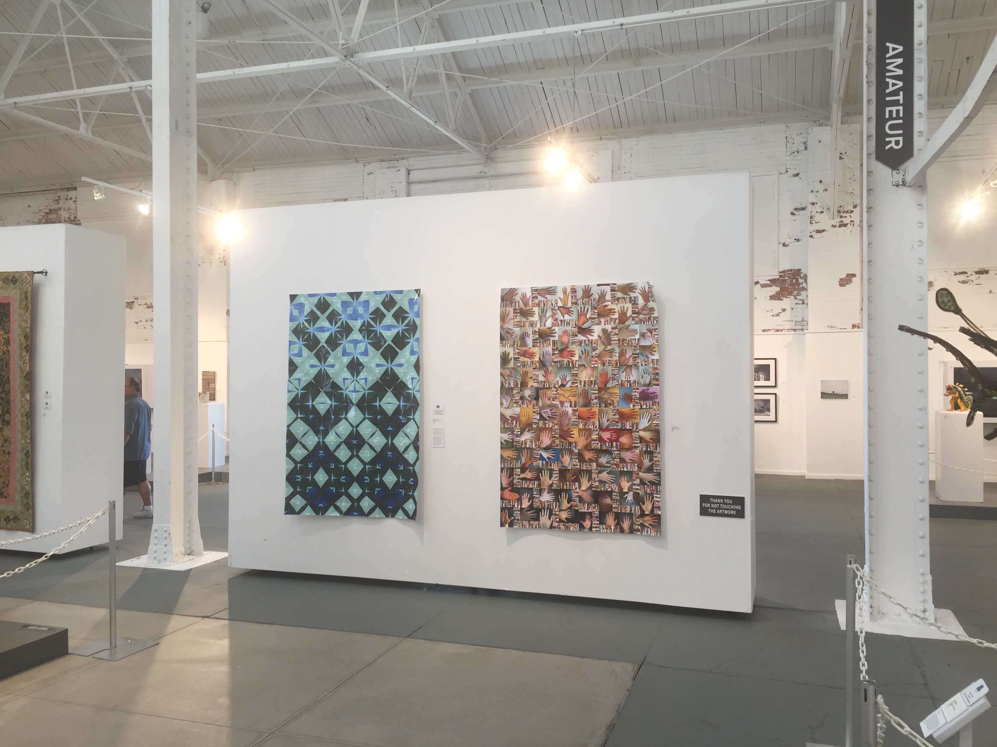
This piece is still a work in progress, but it’s been in progress for long enough that it’s time to share it.  I’ll continue to update this post until it is completed.

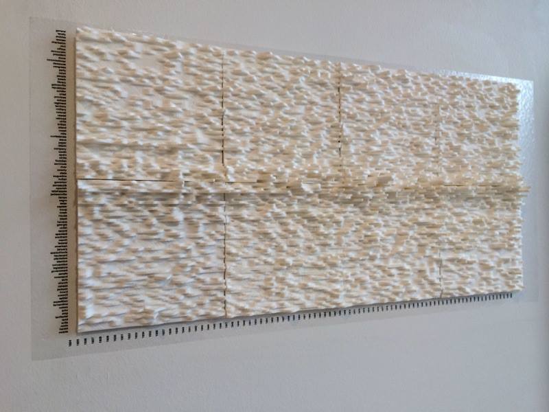
It all started with a conversation I had with David Staley, a futurist history prof who teaches design and thinks about things like digital humanities.  He had worked with colleague Matt Lewis on a dataset they gleaned from the Florida Historical Quarterly, an academic journal.  The set contained the one hundred most frequent keywords across the 86-year history of the journal.  On paper, the dataset looks like a table with the years 1924 through 2009 across the top, keywords like john, tallahassee, and cotton down the side, and numbers creeping into the low teens scattered throughout.  It’s a very rich dataset, but it ain’t much to look at.  So, they 3D printed it.

staley 3D print3D printed data

Once it was printed out, new patterns started to emerge — for example, the decline of the term negro and the increase of the term black to refer to African Americans.  Sure, these patterns were there when the data was encoded in numbers, but the virtual absence of the keyword black — it occurs just three times from 1924-1967 — was more obvious as a physical trough within the dataset.

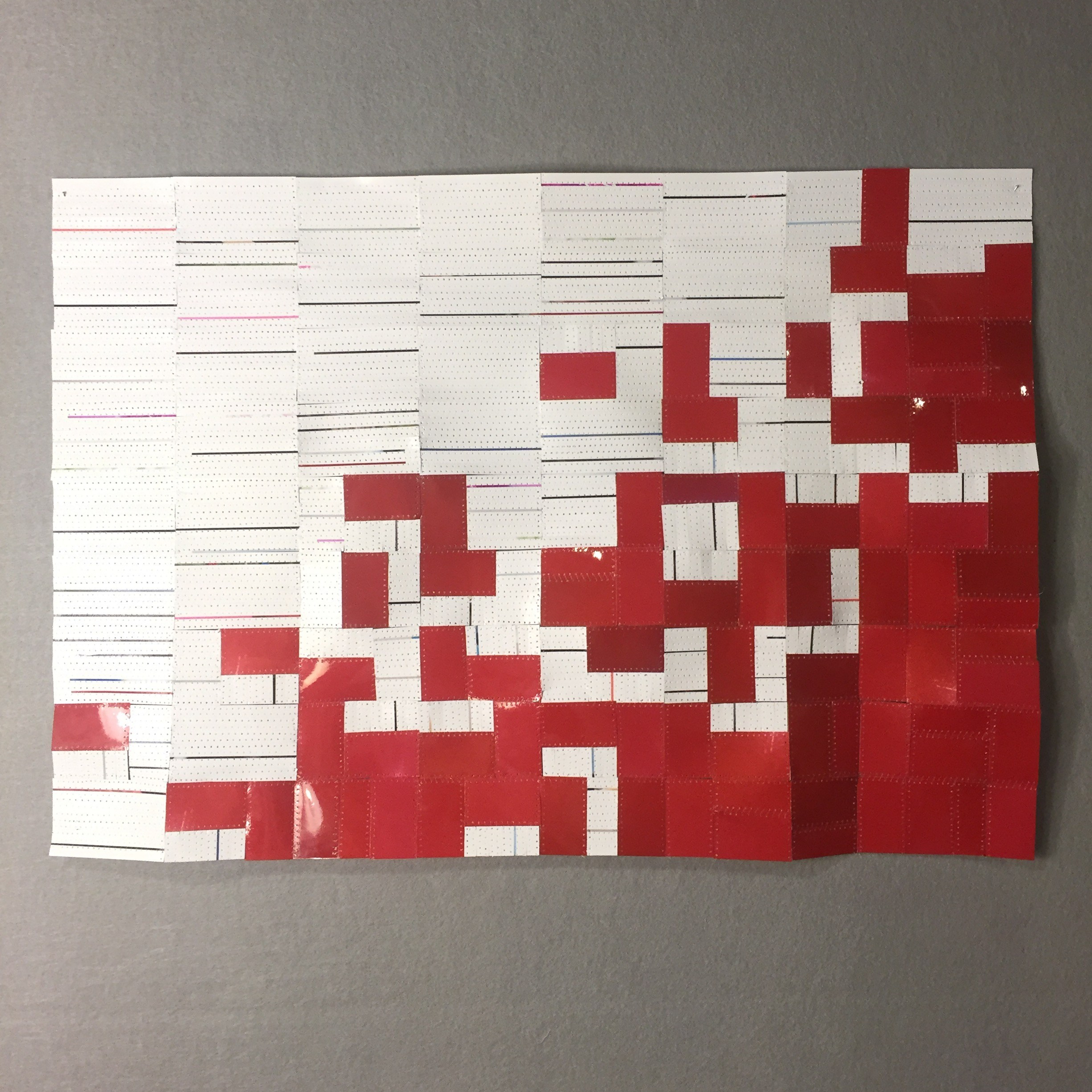
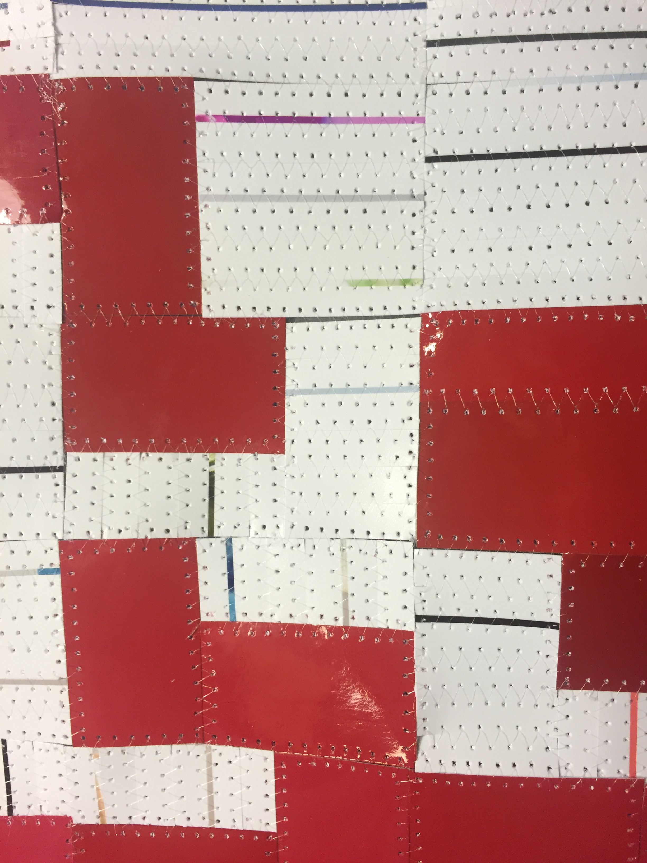
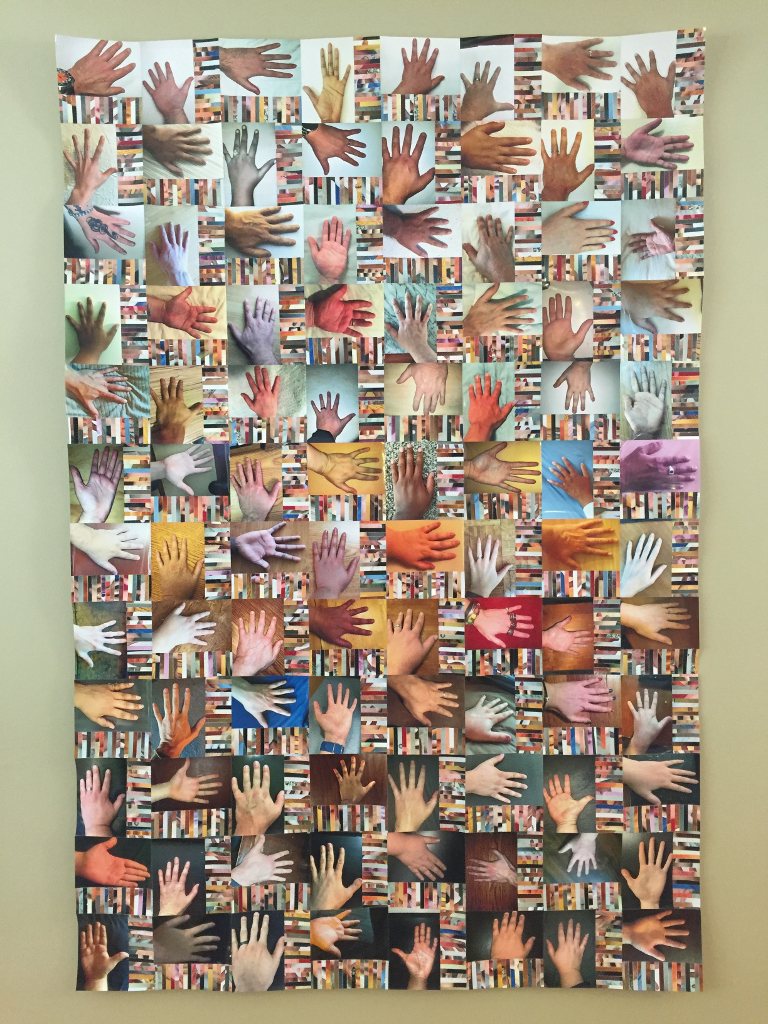
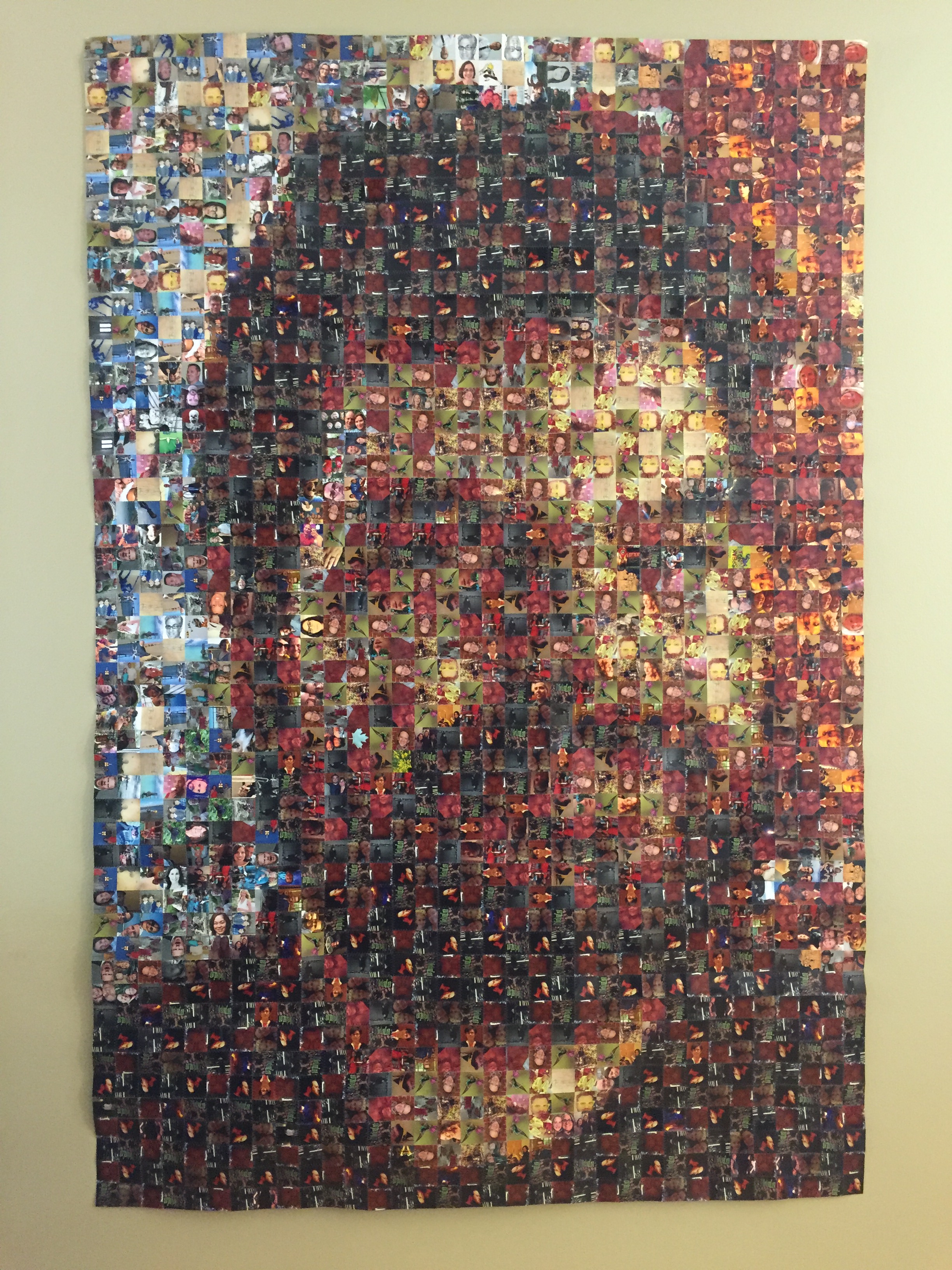
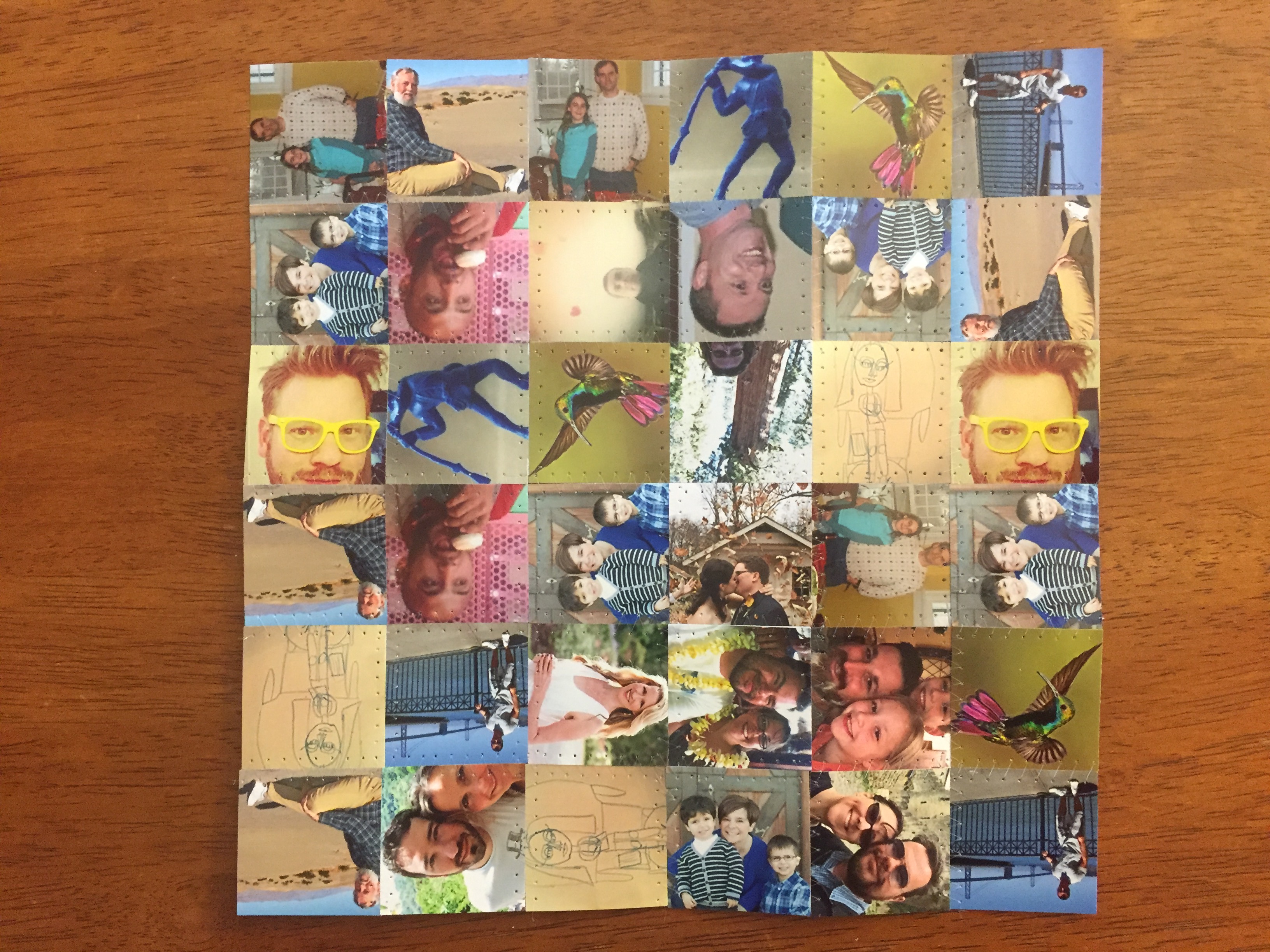
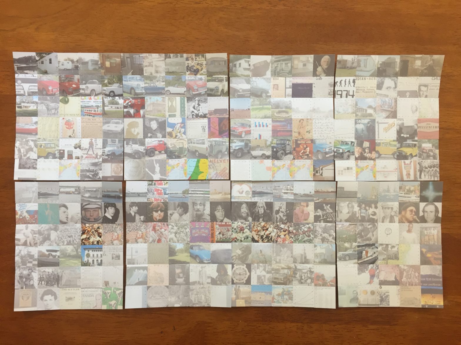
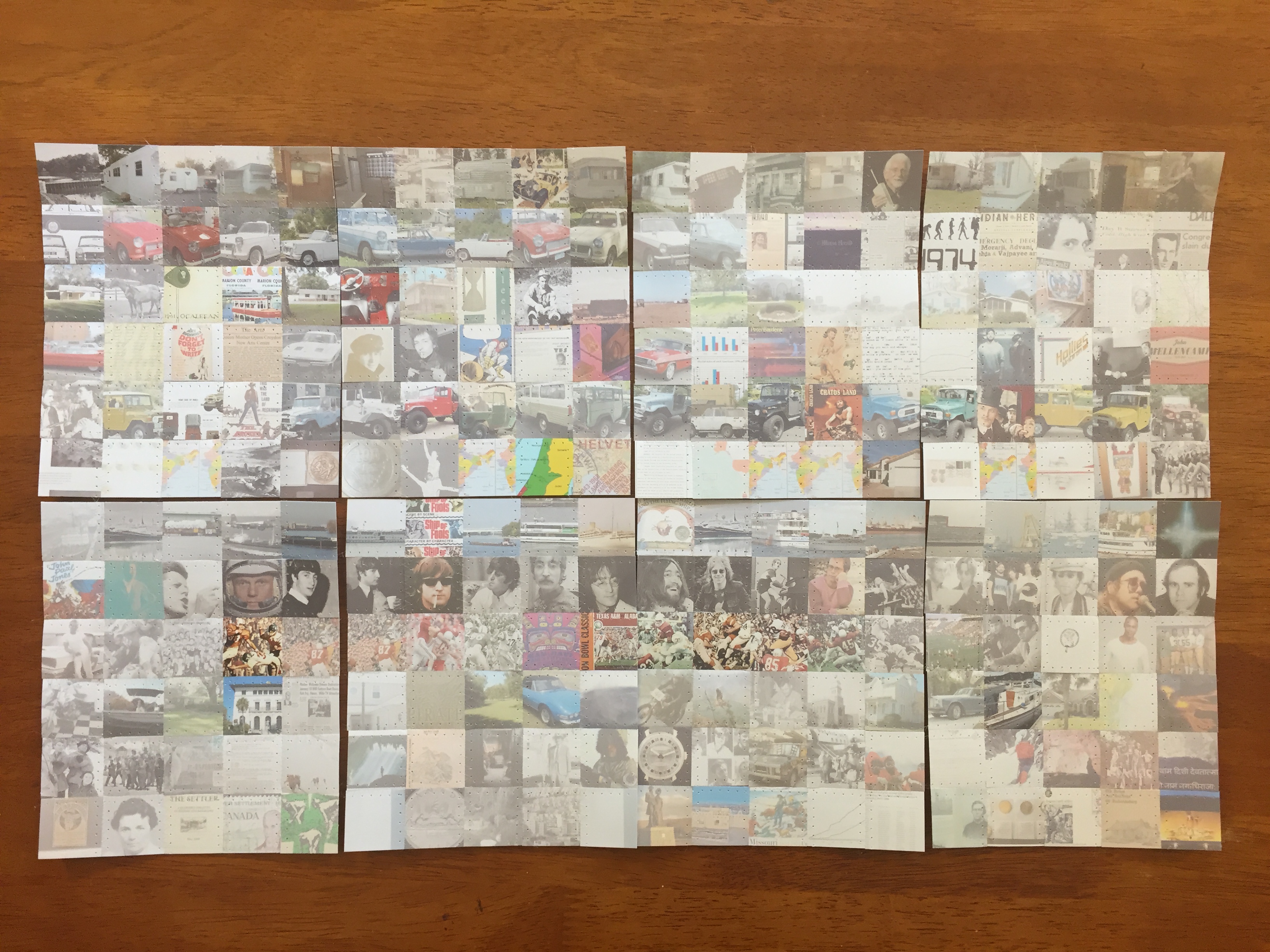
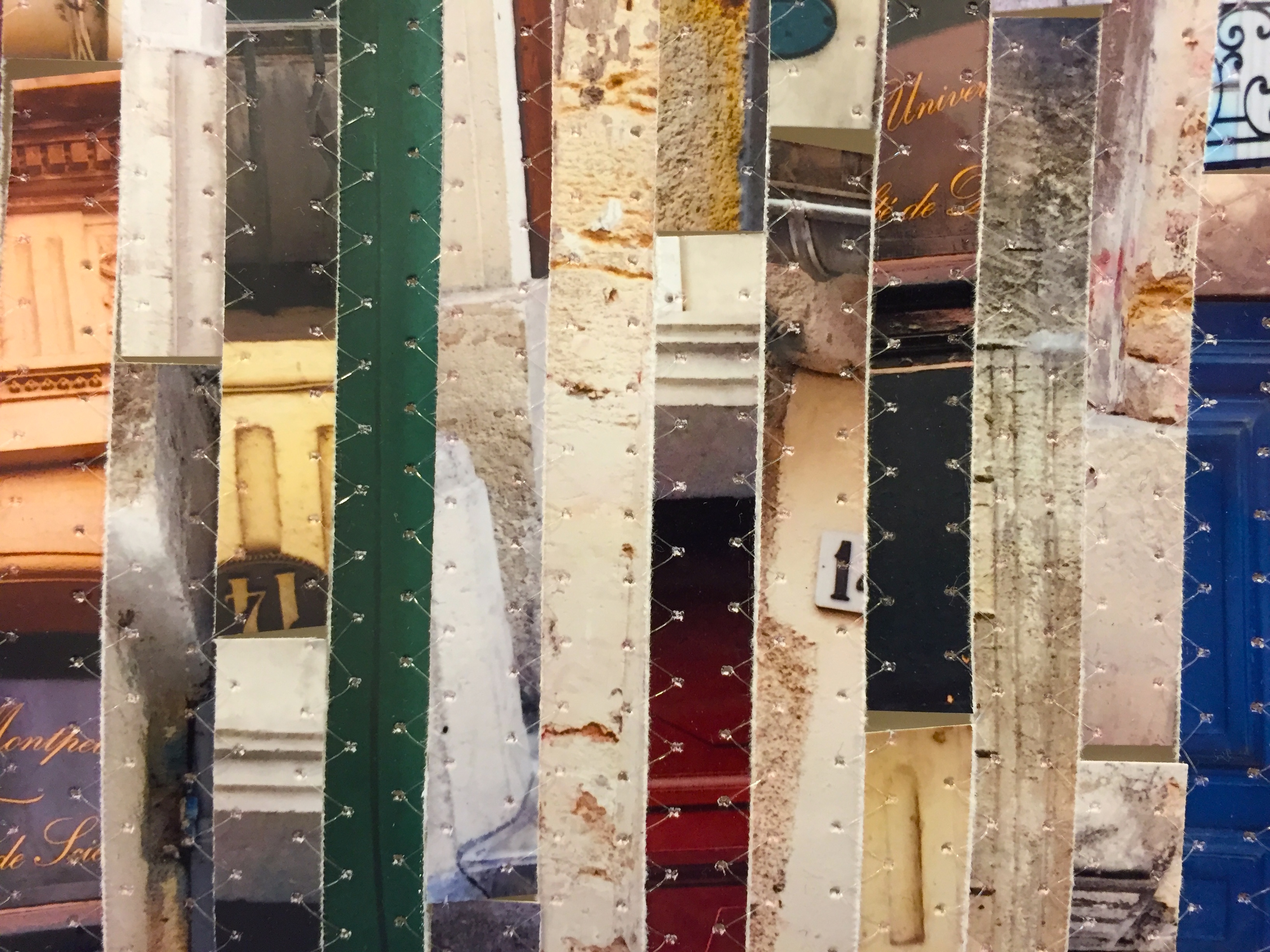
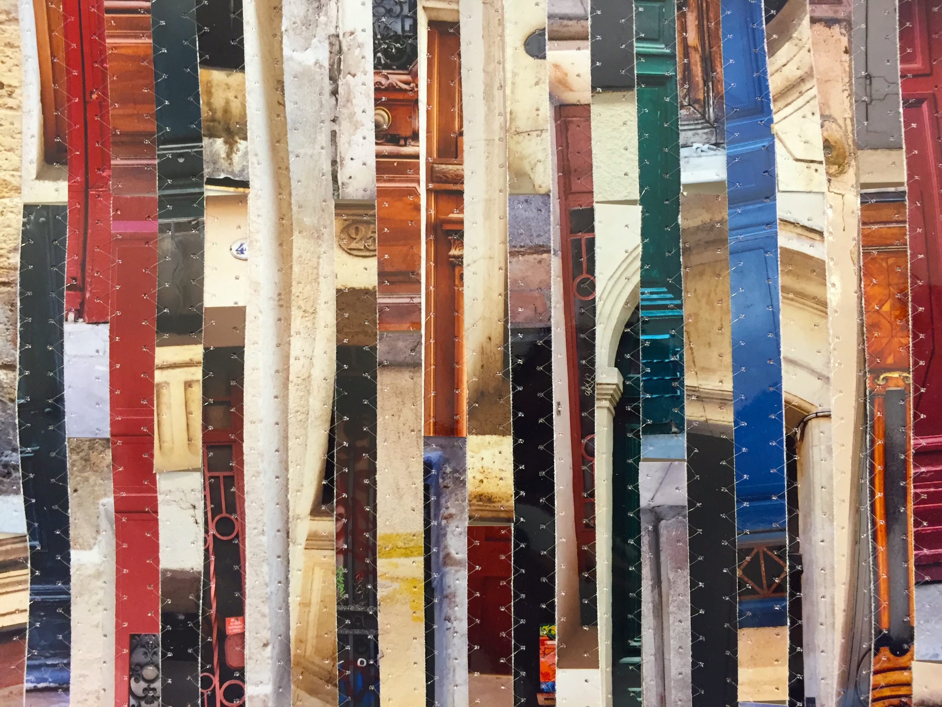
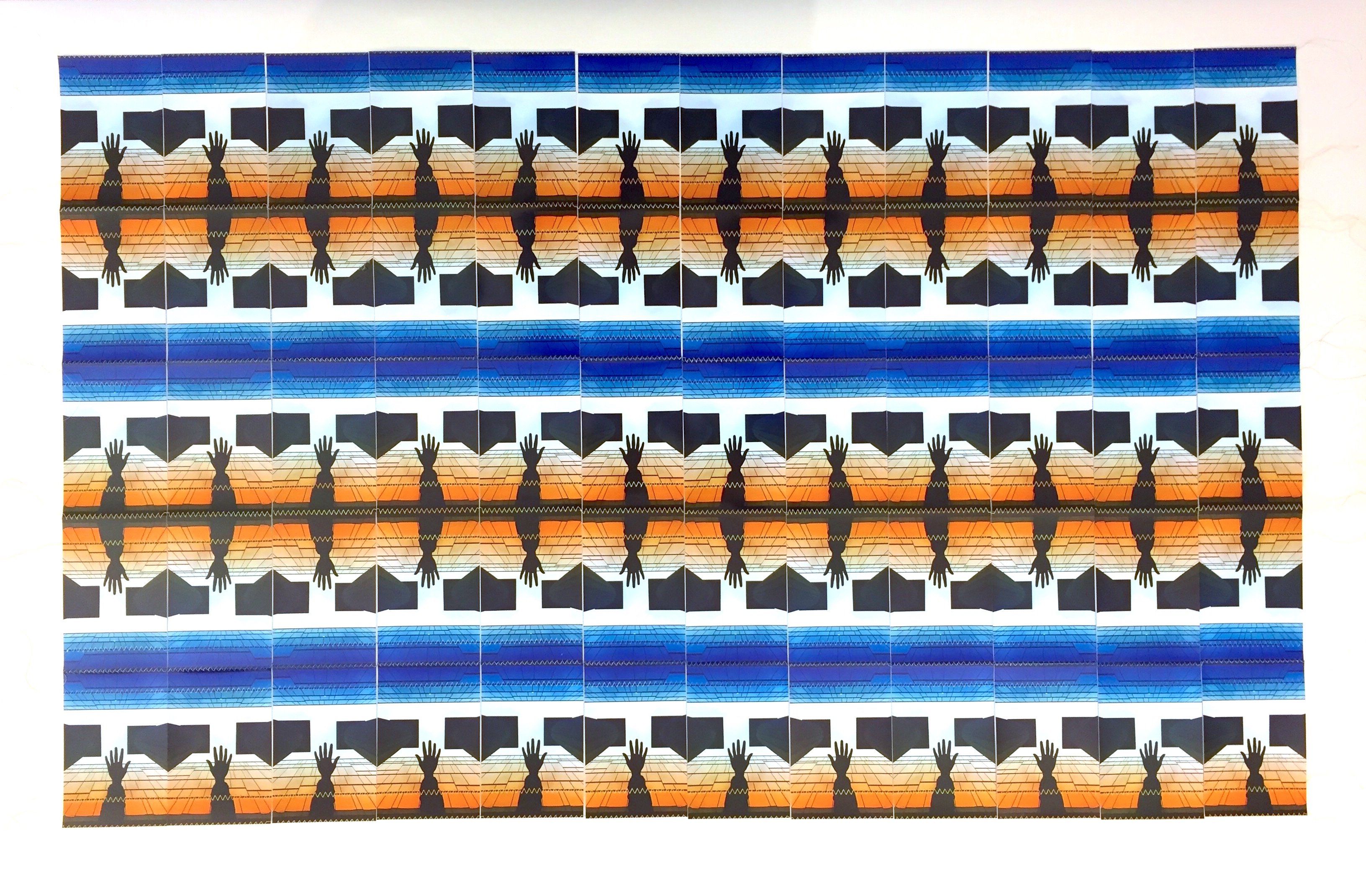
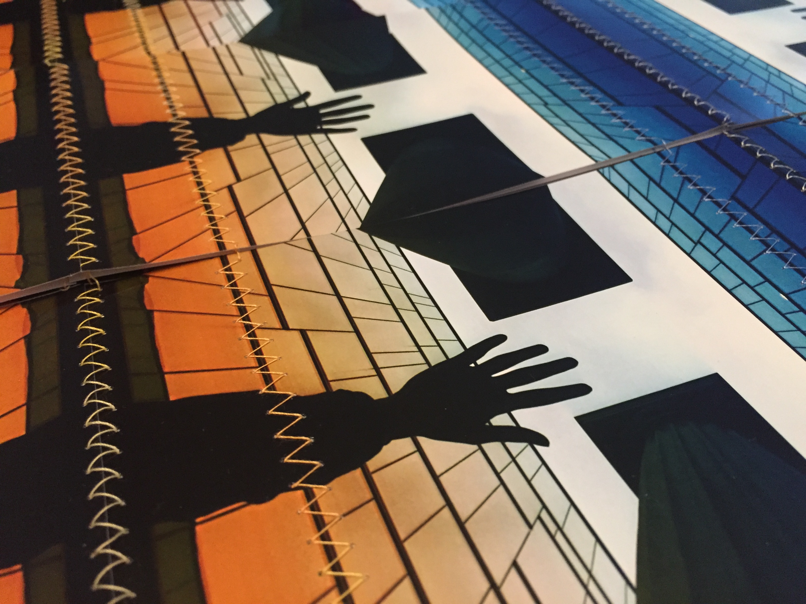
I started to think how I would interpret the same data through a photoquilt.  I decided to look at the highest ranked photo on a Google image search of every combination of keywords and years.  For example: cotton 1924cotton 1925, … cotton 2008cotton 2009, etc.  To form the quilt, I digitally cropped every image, printed them out onto standard 4″ x 6″ prints, physically cropped them into one-inch squares, and started sewing them together.

IMG_1714
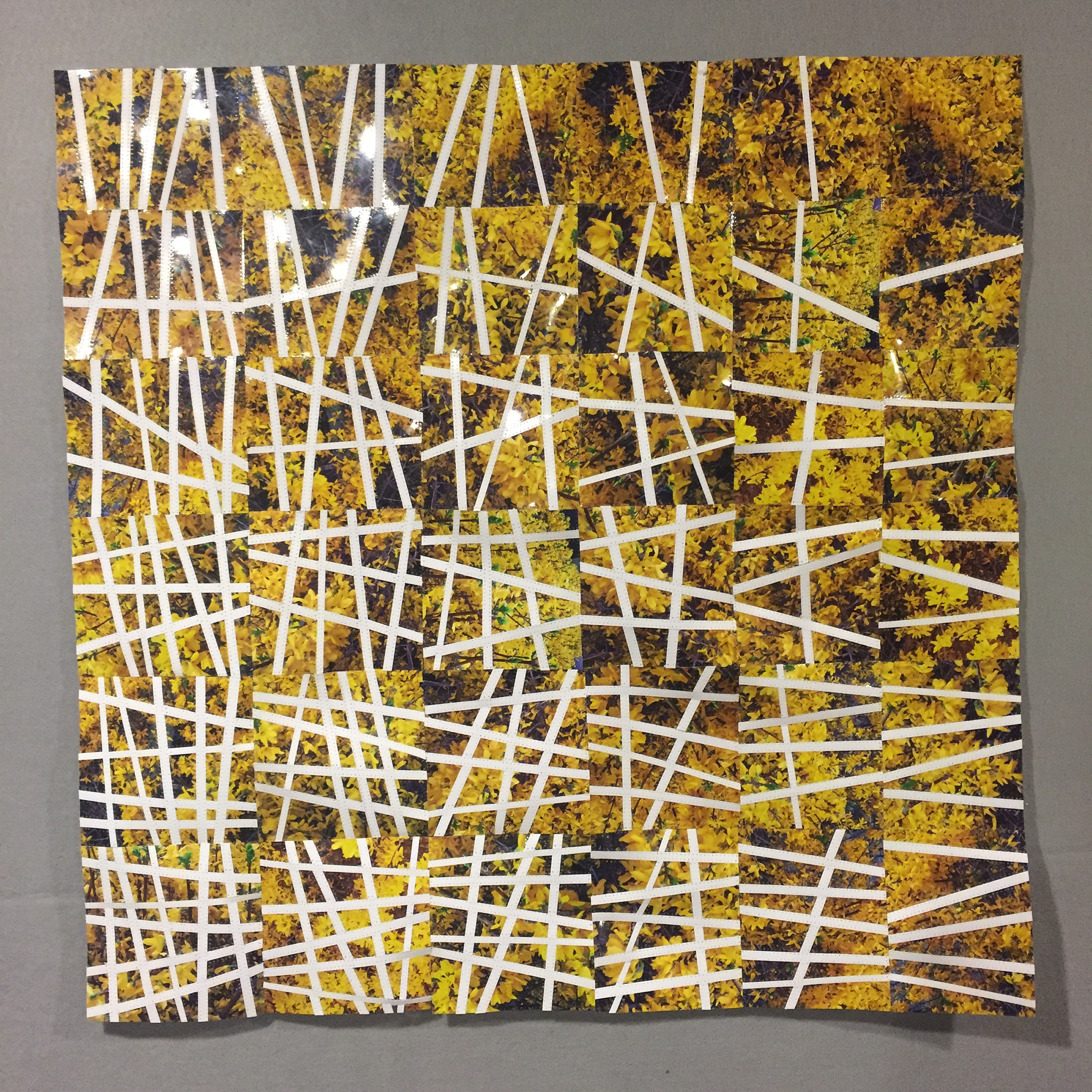
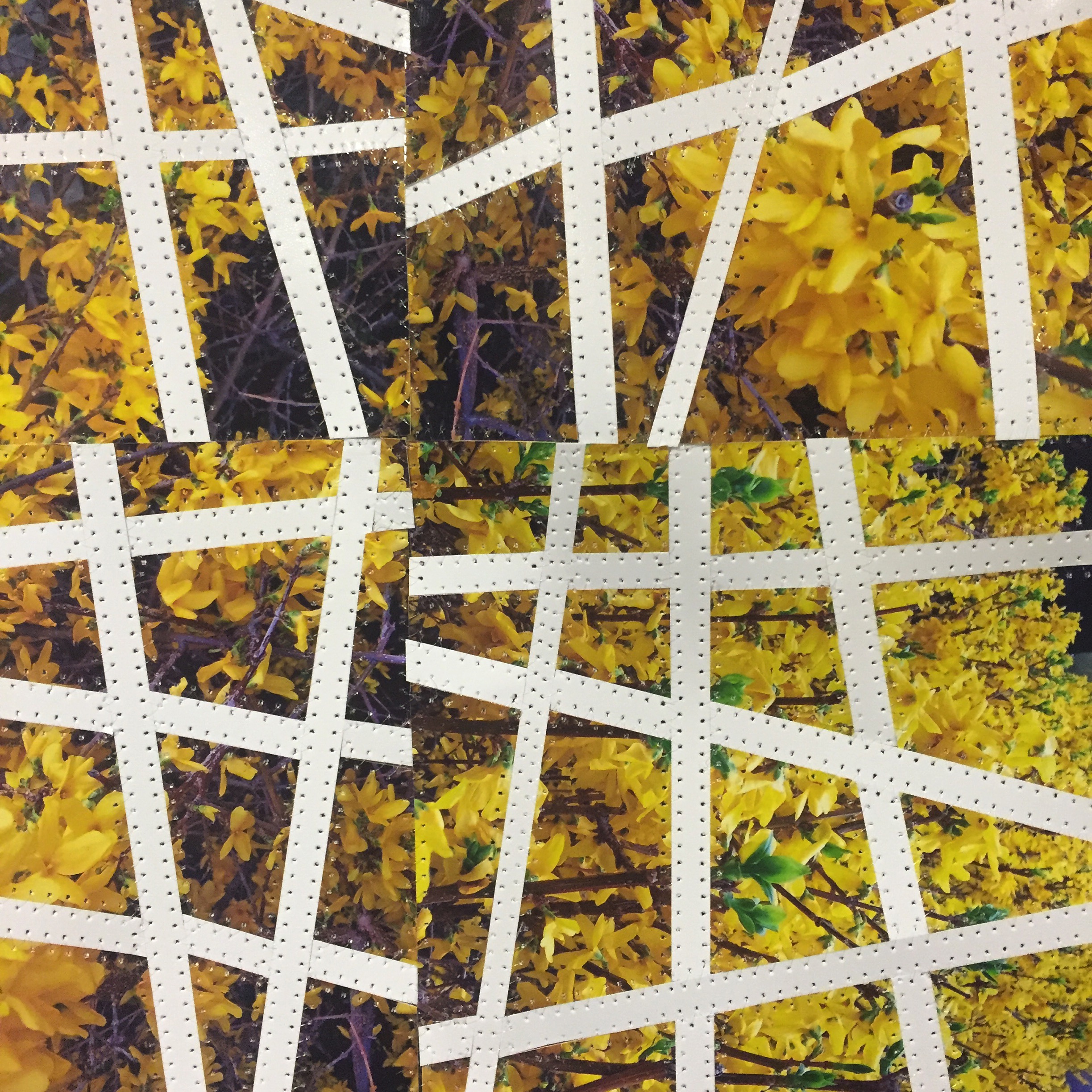
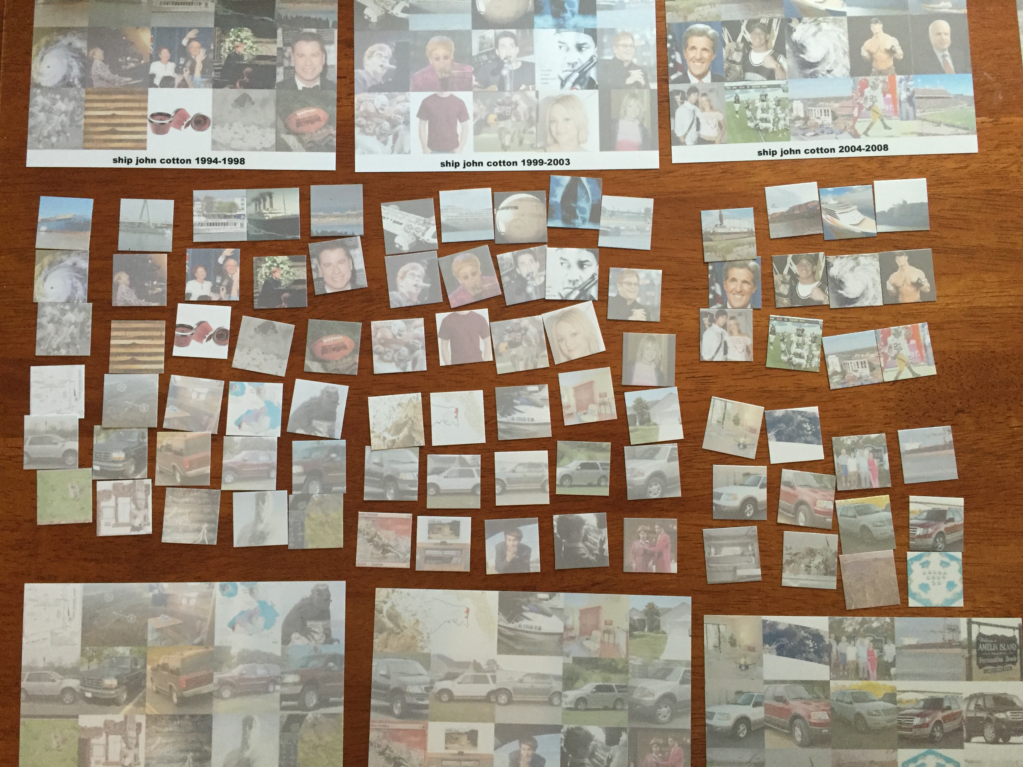
ship to settler, 1994-2009; cropped

Viewing the original data through the lens of the Google search algorithm provided me with an interesting dataset of my own.  It is a way to view a visual culture (in the cotton examples above, the meaning shifts from the agricultural product to the annual college football game) but it is also tailored to the time and place that I did the searching.  Anyone else doing identical searches would get different results based on all of the factors considered by Google’s search algorithm.  In fact, some of the search results have changed since I did my first round of searches.  Other photos would not have been included in the search results had I performed the searches earlier in time.

Within the collection of images, several interesting patterns and trends emerged.  For example, John Lennon was the highest ranked john in 1940, his birth year, and he dominates most of the 1960s, along with a couple of John F. Kennedys, before being briefly supplanted by Elton John in the 1970s.  Lennon returns around the time of his death in 1982, however.  This set provides an interesting interpretation of the most popular “John” for each year (according to Google’s algorithm).  Other terms reflect similar cultural transitions: mobile evolves from a city in Alabama to the art of Alexander Calder to the telephone, expedition from polar explorers to a popular SUV.

The term negro is another interesting case.  The first half of the twentieth century provides a lot of what you might expect — lots of Negro League Baseball team photos with occasional caricatures and stereotypical portrayals of African Americans.  But in the later years, the use of negro as the Spanish word for black dominates, mostly in the form of black cars for sale in each model year.  (For example, cars are the top 14 search results I get for negro 2006.  Your results may vary depending on your computer’s settings.)

I found cars to be among the most common search results along with real estate for sale, movie posters, portraits, and maps.  I had assumed that when I searched for one of the many cities that were keywords I would see an image of that city from that year.  But often I would get an image of a house for sale at that address in that city.  For example, fenandina 1957 returns several images of a house on Amelia Oaks Drive.  (Again, your results may vary.)  In fact, I had been lulled into a bit of complacency about searching for these towns when I came upon augustine 1964, which depicts a man dumping acid in a pool in response to a civil rights protest by black and white swimmers in a whites-only pool.  I didn’t know anything about this incident, which made the image even more shocking to me.

IMG_1715
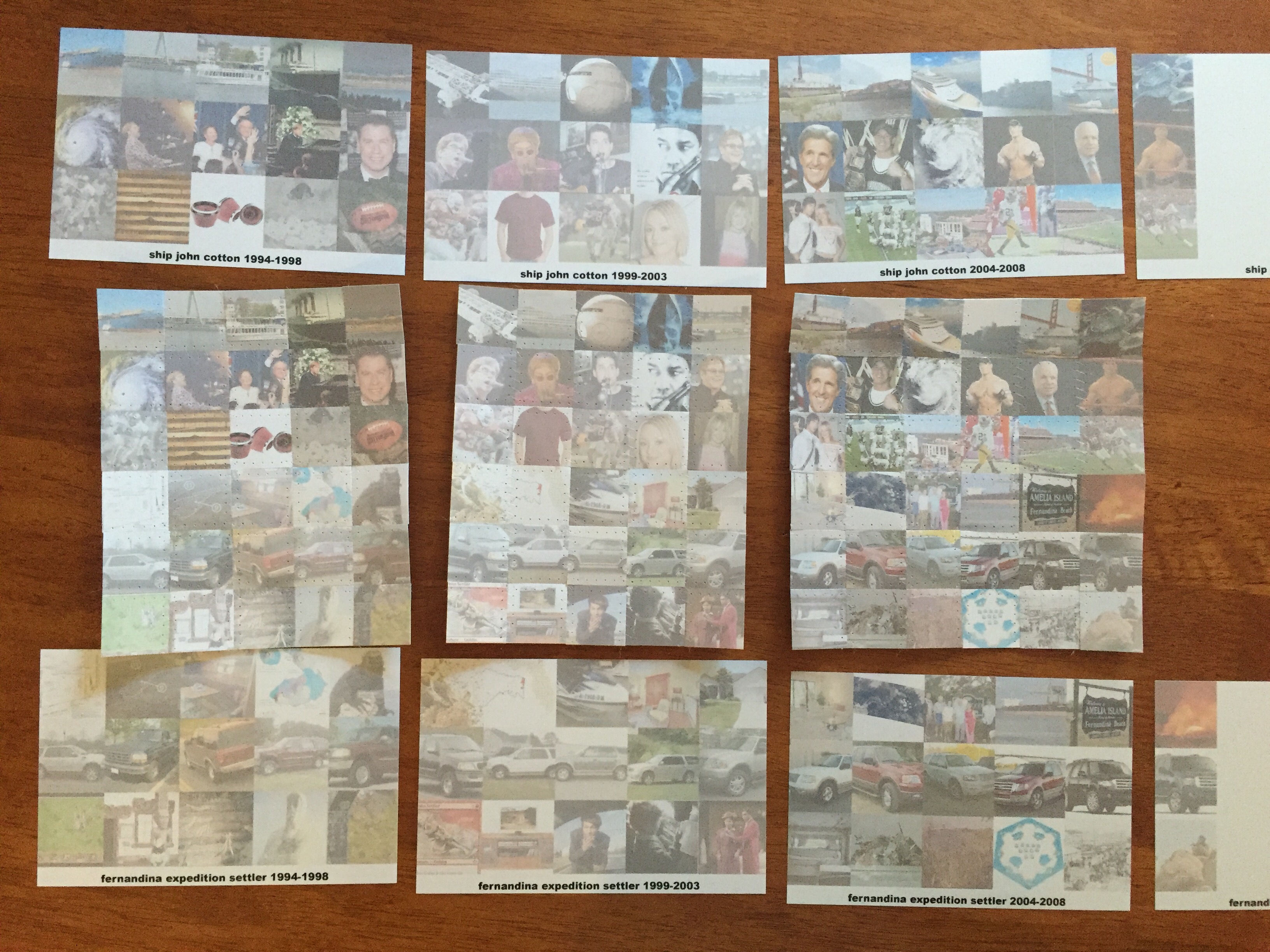
ship to settler, 1994-2009; sewn into blocks

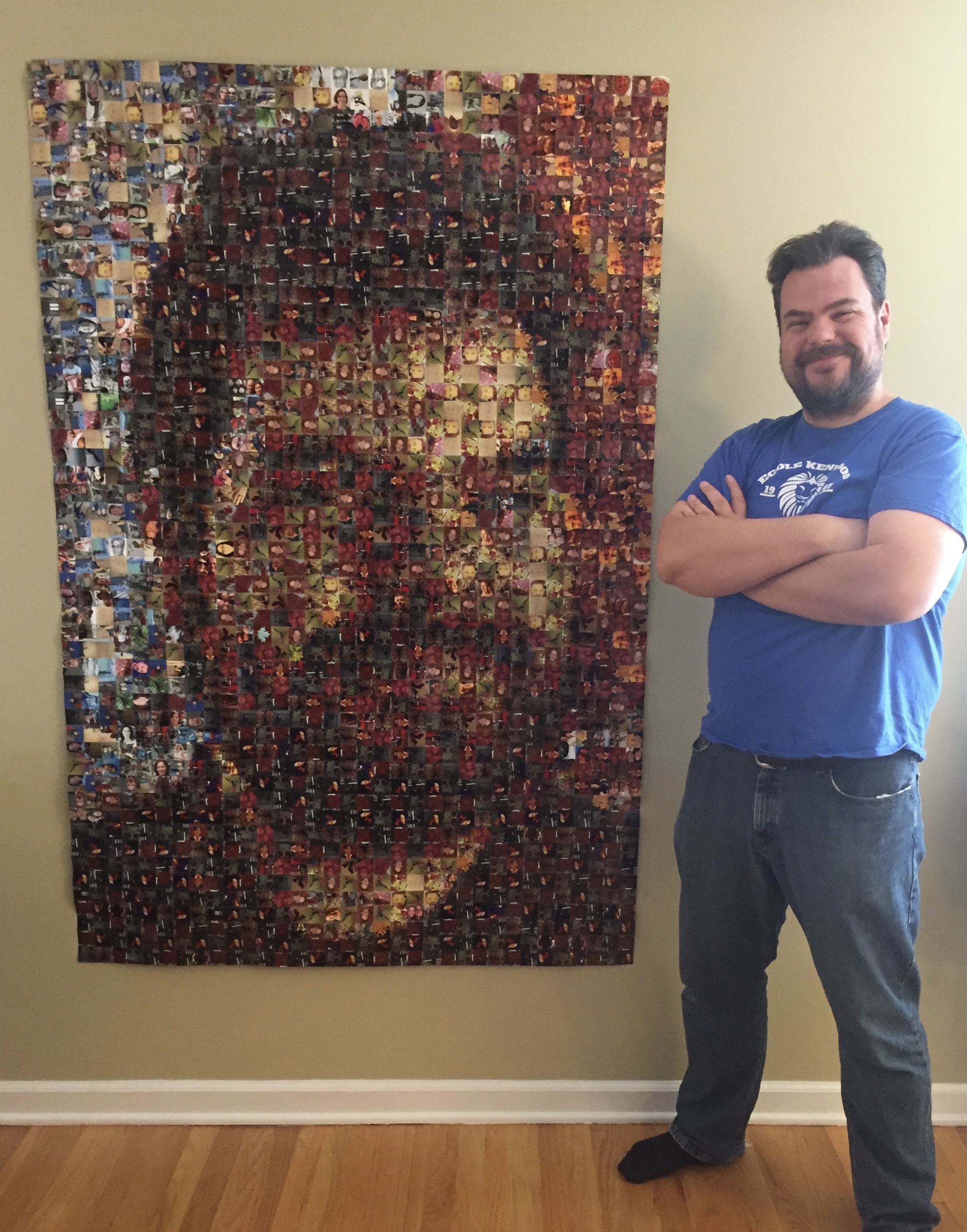
When finished the quilt will measure 86″ by 100″, which works out to 7’2″ by 8’4″.  I have encoded the peaks and valleys of the original dataset by fading out the images that represent the combination with fewer keywords.  From a distance, the viewer should be able to make the patterns in the data, but up close the patterns of the individual images will be visible.  So far, I’ve completed blocks for 12 out of the 100 rows of 1″ squares.  Stay tuned for updates as I make more progress.

Spaghetti

spaghetti full

24″ x 24″
2016
$200

This photoquilt was inspired by a box that my wife and I brought back from our honeymoon in Italy.  The box is about six inches wide and is made of strips of semi-precious stones which were likely leftover from the other pieces for sale in the shop.  When we asked what the pattern was called, we were told they call it “spaghetti.”  We both loved the “use the whole buffalo” approach to the creation of the box as well as the overall effect of the random mix of stones, so we splurged and bought the box.

Last year, we finally had the chance to travel back to Europe where I was struck by the unique and colorful doors throughout the oldest part of Montpellier, France.  I took pictures of hundreds of them for Les Portes de Montpellier.  When that photoquilt was finished, I still had scores of prints left over.  What to do?  Cut them into strips and sew them back together, obviously.

The similar palettes first gave me the idea that this could work.  The jewel tones in the doors of Montpellier are what first drew me to photograph them and the link to the colors in the box was obvious.  The European connection and the approach to making use of otherwise discarded materials also tied the two together.  There is also a sort of re-imagining of the image here.  Unlike most of my other quilts, the subjects of the photos are almost completely obliterated.  This results in a focus on the almost painterly  surface instead of the details of each individual photo.

The spaghetti box and the Spaghetti photoquilt are two of my favorite souvenirs of our rare European adventures.

Les Portes De Montpellier photoquilt
Les Portes de Montpellier photoquilt

spaghetti box
The spaghetti box that inspired this photoquilt

spaghetti detail 1
Spaghetti – detail #1

spaghetti detail 2
Spaghetti – detail #2

spaghetti detail 3
Spaghetti – detail #3

Blanket

blanket full

30″ x 48″
2016
$150

Coming up for a name for this photoquilt was actually a bit of a challenge. Originally, I was thinking about something clever like Give Me 300, a nod to the number of high fives in all of the photos. But in the end, I settled on Blanket because the quilt looks so much like a woven blanket from the American Southwest, Mexico, and many other places. In fact, the blanketness was so compelling that I used multicolored cotton thread and added some decorative stitches in addition to those that sew the photos together. So, in a way, Blanket has more quilting than most of my other photoquilts.

The original photo that I used for this photoquilt was taken by my friend Mark Koenig at Ohio State’s Knowlton School of Architecture, a location that has previously been the subject of one of my Ohio Star photoquilts. When I was talking to Mark about making an Ohio Star photoquilt using one of his photos, I chose two images as possible subjects. This is the one I didn’t use. I love the colors and the composition, but in the end I didn’t think the lines would work well in an Ohio Star. After deciding it wouldn’t make a good Ohio Star, I laid the prints out in neat rows, which brought out a repetitive, woven quality. The repetition is similar to several of my other non-Ohio Star photoquilts. But in those quilts, each image varies very slightly (or fully, completely), whereas in Blanket there is simply a single photo and its mirror image.

What started as a stack of rejected prints has become a bridge between my different series of photoquilts and a chance to try new quilterly techniques. The result has a certain comfortableness that wears the name Blanket well.

See more of Mark Koenig’s work on Instagram.

Blanket - original image
Blanket – original image, courtesy of Mark Koenig

Blanket - detail
Blanket – detail